WE HAVE a winner! A clear winner, in fact. As of this writing, with 92 “likes,” the easel sign that readers liked the best is:
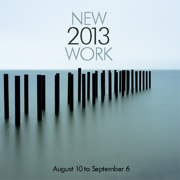
This has been so interesting to me. A couple of my favorites came in second and third, but this was clearly the top choice, by almost 30 votes. Ironically, neither Alison nor I “get” this one. The “2013” in between the other words doesn’t make sense to me, and the “NEW” makes it redundant, I think. So, what to do? We respect the votes, and wanted to make this work.
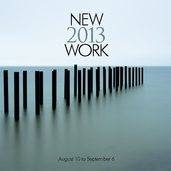
Yesterday, in anticipation of the Arts District Stroll today, we hung our newest show. So I worked for awhile on the winning design. Just a tweak, I thought. I needed to alter it so we’d like it better, but stay in the spirit of the concept our readers like best. I came up with the following, with Alison standing behind my desk. “I was just about to suggest putting the “2013” in a serif,” she said as I did it. We’re usually in agreement about these things, so that confirmed it. We like it now:
Thanks for all of your great suggestions! I hope you like the end result. I’ll let you know if anyone stops in and asks where the New York photos are…
Leave A Comment