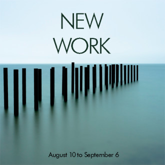
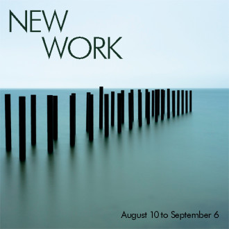
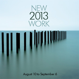
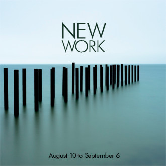
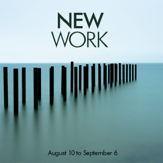
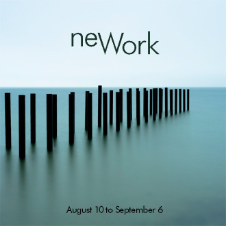
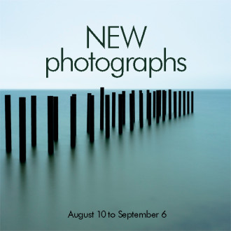
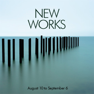
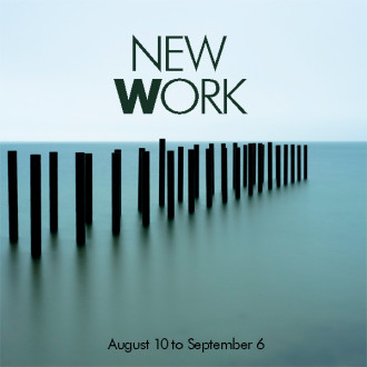
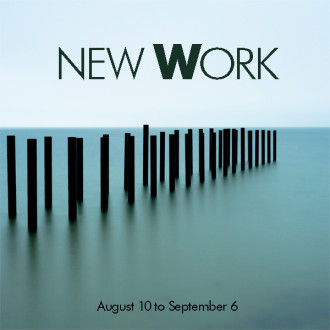
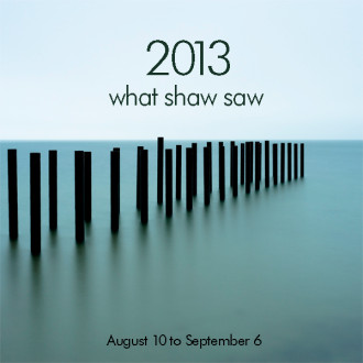
IT’S TIME TO DESIGN my new easel sign for outside the gallery. We’re producing Alison’s latest photographs, and will be hanging them this Friday for our new show, and this Saturday’s Arts District Stroll (from 4 to 7 – hope to see you there). We got so many great suggestions and comments for my last blog post, that I decided to mock up most of them, and ask for your votes. If you haven’t read my last blog entry, please do, so you understand why I’m doing this! Our programmer, Heather, found these dandy little thumbs up/down thingies that make it easy to vote, and keep track of what you think. Today was the fun part – doing all the suggested designs and word combos. As I said in my last post, I like trying everything, even if I think I won’t like it. I’m always interested to see how suggestions look, and sometimes I’m surprised by my reactions to them. Design is a process.
One thing I’m realizing is that the inside joke (“New Work” looks like “New York”) is funny, if you get it. But designs based on the joke might be confusing for customers who weren’t in on this conversation. Again, read my last blog if you haven’t, so you get what this is about. I’ve always thought that if someone thinks “why?” when they see a design, as in “why’d they do that?” or “what does that mean?”, it’s not good design. At the Globe, you’d know there was an unnecessary or superfluous thing on your design, for example, if another designer came over and used their finger to “flick” the thing off the page, as if to say “get this off of here, it doesn’t work.” The goal is simplicity and clarity. It should be “yeah, of course – that’s obvious.” It can be deceptively hard to achieve that. This is why major redesigns of publications and websites often include research via focus groups, followed by updates based on the user feedback. We designers lose our ability to be objective, because we’re too close. We can’t replicate a fresh look at something we’ve been looking at for awhile. So that’s when it gets fascinating – seeing how our best efforts pan out when the public responds to them.
So here goes! Please click thumbs up or down under the examples. [Update: my cute little thumb icons aren’t supported anymore. Bummer…] No matter how it works out, every one of our reader’s suggestions is worth trying, and is much appreciated! I tossed a few of my own in here, but most of them are from you. Can’t wait to see what you think…

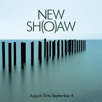
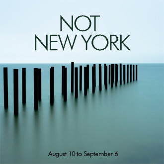
Of course if you really want to confuse them you could use , ” Newark “
I’m not sure I can stop chuckling over all the ones which I’m positive are completely tongue in cheek, for long enough to rate the choices :-)
Yeah, some of them are definitely tongue in cheek, from readers, and from me. It’s fun.
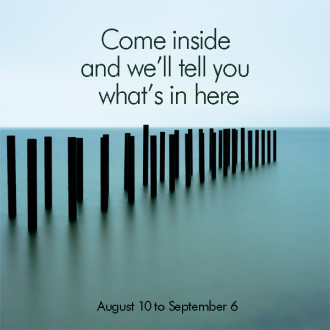
I like the last one but to say come inside and will tell you what’s new
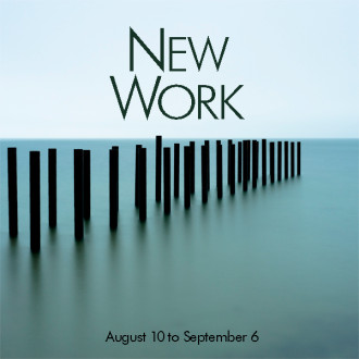
Thanks Catherine – I just did that one as a joke! We hang the gallery with all new work each show now, so that’s what I want to convey.
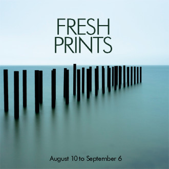
Sue/Alison I don’t like the word “work” and sorry, but don’t care for that image. I LOVE the previous one with the flower and the dates.
I like something a little more communicative/intimate like The Midsummer Show The Early Summer Show Something more descriptive.
I’m a photographer and use the word “work’ about my own but you see the word ‘work’ and it’s not appealing to me.
Alison’s photographs are so powerful, fun, introspective, beautifully rendered, happy, colorful, on and on. New Work …I don’t even care about the New York thing. At least someone went in!
Darn, but you creative though. thanks for listening. Anne Henning
Thanks, Anne. Whatever we do needs to be simple and clear, so we can keep doing it for each show. And the “new” is important, since people always ask if she has any new work. Great feedback about “work.” It says “art” to me, but not to everyone – I appreciate this!
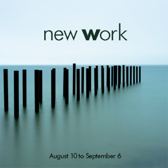
Mickey, you’re just full of good ones ;). I still can’t look at “New Work, New Work” without Sinatra crooning in my mind for the next hour…
I can see everyone in Oaks Bluff walking around town singing and humming New York , New York . Frank would be proud.
we’ll have to do a shirt…
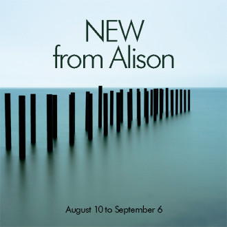
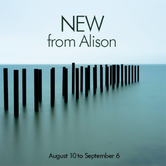
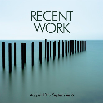
I think swapping ‘Recent Work’ (the second one down) for ‘Alison Shaw’ in the same font would further promote Alison as artist, and for those already familiar, the new image speaks for itself.
Hi Beth – Theres already a huge sign on the building that says “Alison Shaw,” so it’d be redundant. But it’s a great idea though – thanks!
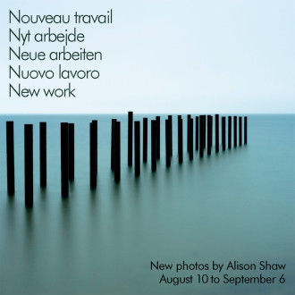
I believe you want to use the word ‘oeuvre’ rather than ‘travail’ to indicate artwork in French, so it would be ‘nouvelle oeuvre’. Just in case you decide to go with the multi language option. It is fun and informing to see all the different design ideas, thanks!
You’re right Evy. I copied it from a reader’s suggestion. Good catch.
I liked the New 2013 Work.
Even better, maybe, New 2013 Works
Have a great show…as always.
Thanks Bill. Seems to be a popular one.
Hi Sue,
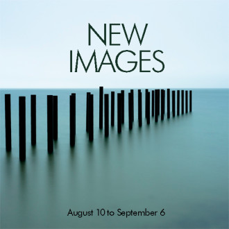
I never saw the “New York”in New Work so I thought it was great to begin with, did like some of the other ideas, though , as well ! ( New Images ) Good luck with this !
Thanks Darlene. It’s certainly a Rorschach Test. I didn’t see it either – that’s why it’s so fascinating to me.