And the winner is …

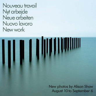
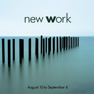
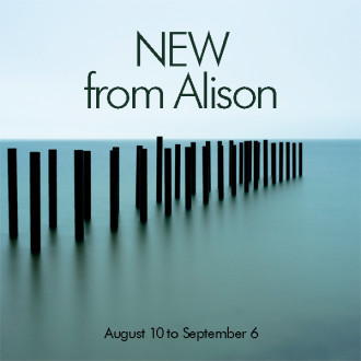
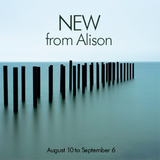
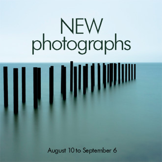
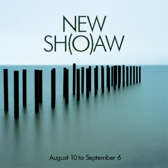
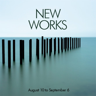
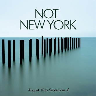
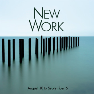
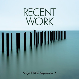
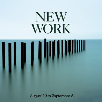
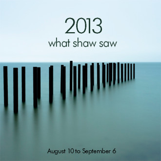
WE HAVE a winner! A clear winner, in fact. As of this writing, with 92 “likes,” the easel sign that readers liked the best is:
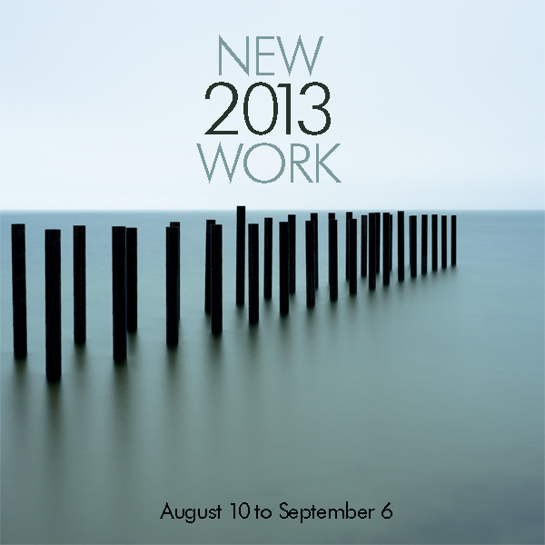
Monhegan

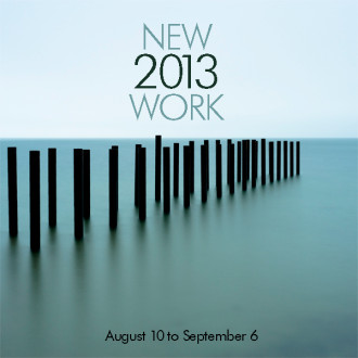
This has been so interesting to me. A couple of my favorites came in second and third, but this was clearly the top choice, by almost 30 votes. Ironically, neither Alison nor I “get” this one. The “2013” in between the other words doesn’t make sense to me, and the “NEW” makes it redundant, I think. So, what to do? We respect the votes, and wanted to make this work.

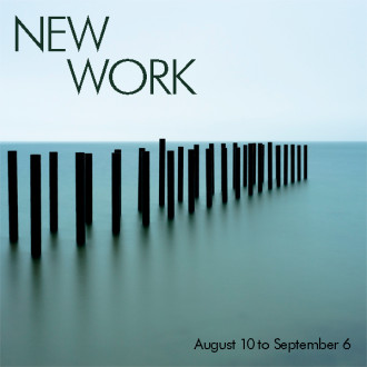
Yesterday, in anticipation of the Arts District Stroll today, we hung our newest show. So I worked for awhile on the winning design. Just a tweak, I thought. I needed to alter it so we’d like it better, but stay in the spirit of the concept our readers like best. I came up with the following, with Alison standing behind my desk. “I was just about to suggest putting the “2013” in a serif,” she said as I did it. We’re usually in agreement about these things, so that confirmed it. We like it now:
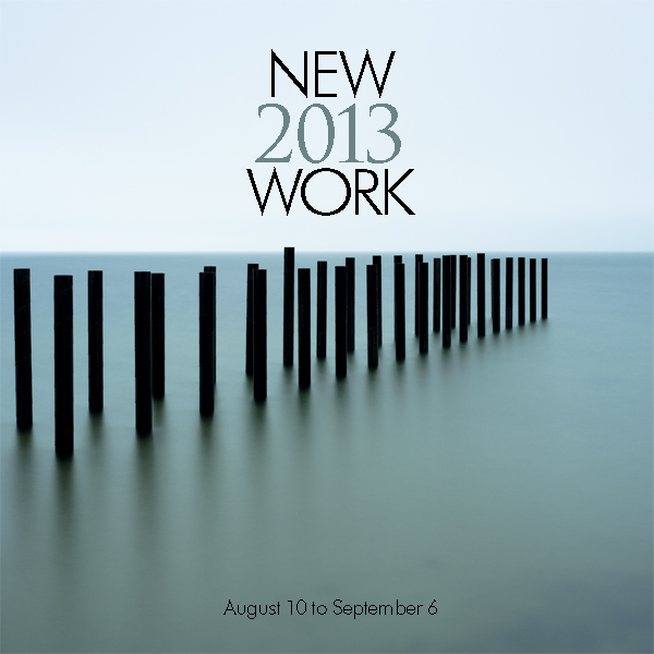
Monhegan

Thanks for all of your great suggestions! I hope you like the end result. I’ll let you know if anyone stops in and asks where the New York photos are…
2022-05-28T17:58:45+00:00August 10th, 2013|0 Comments

I’d love your feedback…

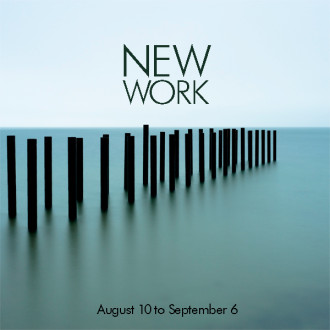
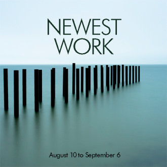
IT’S TIME TO DESIGN my new easel sign for outside the gallery. We’re producing Alison’s latest photographs, and will be hanging them this Friday for our new show, and this Saturday’s Arts District Stroll (from 4 to 7 – hope to see you there). We got so many great suggestions and comments for my last blog post, that I decided to mock up most of them, and ask for your votes. If you haven’t read my last blog entry, please do, so you understand why I’m doing this! Our programmer, Heather, found these dandy little thumbs up/down thingies that make it easy to vote, and keep track of what you think. Today was the fun part – doing all the suggested designs and word combos. As I said in my last post, I like trying everything, even if I think I won’t like it. I’m always interested to see how suggestions look, and sometimes I’m surprised by my reactions to them. Design is a process.

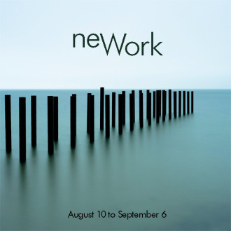
One thing I’m realizing is that the inside joke (“New Work” looks like “New York”) is funny, if you get it. But designs based on the joke might be confusing for customers who weren’t in on this conversation. Again, read my last blog if you haven’t, so you get what this is about. I’ve always thought that if someone thinks “why?” when they see a design, as in “why’d they do that?” or “what does that mean?”, it’s not good design. At the Globe, you’d know there was an unnecessary or superfluous thing on your design, for example, if another designer came over and used their finger to “flick” the thing off the page, as if to say “get this off of here, it doesn’t work.” The goal is simplicity and clarity. It should be “yeah, of course – that’s obvious.” It can be deceptively hard to achieve that. This is why major redesigns of publications and websites often include research via focus groups, followed by updates based on the user feedback. We designers lose our ability to be objective, because we’re too close. We can’t replicate a fresh look at something we’ve been looking at for awhile. So that’s when it gets fascinating – seeing how our best efforts pan out when the public responds to them.

So here goes! Please click thumbs up or down under the examples. [Update: my cute little thumb icons aren’t supported anymore. Bummer…] No matter how it works out, every one of our reader’s suggestions is worth trying, and is much appreciated! I tossed a few of my own in here, but most of them are from you. Can’t wait to see what you think…


2022-05-28T18:32:45+00:00August 7th, 2013|18 Comments

Designer’s dilemma

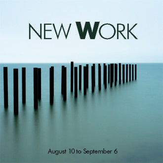
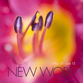
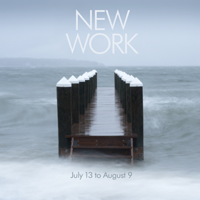
AN INTERESTING THING has been happening at the gallery. Every other week or so, someone comes in and looks around, ending up at my desk with a quizzical look on his/her face. “Is this all New York, or just some of it?” or “Where are the New York photos?” I didn’t get it at first. But it kept happening. Obviously something was triggering the confusion. Finally, someone said “The sign said ‘New York,’ so I’m confused.” We went out and looked at the sign – “Oh my gosh! I thought sure it said New York! I must be losing my mind!”

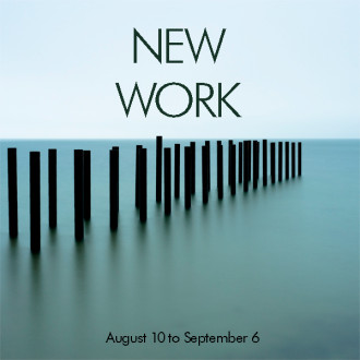
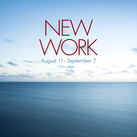
So, for the next couple of shows, I used all caps. That’ll fix it.

Nope.

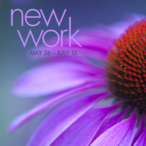
Spread out onto one line?

No.


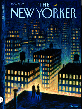
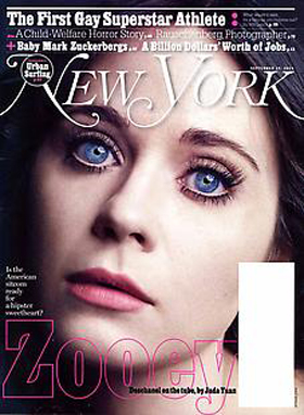
Interestingly, as I’ve talked with these customers, it turned out they were all highly-educated, and most of them subscribed to New Yorker magazine, which uses all caps for the logo. Oh, and there’s New York magazine – also all caps.


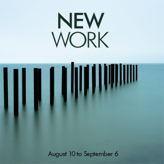
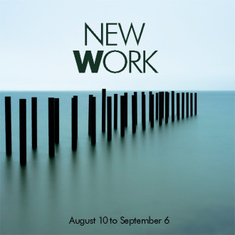
I decided to try a different cut of Futura (the font I use for our business), but in bold (below). One more shot at using the words I want to. Alas, it’s still confusing folks. And yeah, I know it looks pretty much the same as the other ones.

When I was a designer at the Boston Globe, it was fascinating to witness the variations in perception, in people’s response to headlines and design. We were lucky to have a large, diverse staff. Whether it was a page on my drafting table or (later) on my mac, I loved to hear the reactions of passersby. I’d often be surprised at how differences – gender, age, race, sexuality, education, marital status, parents, non-parents, religion, political party, country/state of origin – influenced each opinion. It made for some lively discussions, and hopefully better design.

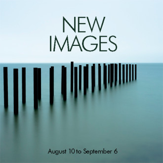
I’ve held on long enough. I’m not sure I’ve ever been this stubborn about wordage on something I’ve designed! But it’s time. I guess I’ve gotta come up with a new way to say that we’re showing all new work. New images? New photos? All new? I want it to feel sophisticated but simple. “Photos” don’t feel like art. But “photographs” is so formal, so long. Designers obsess over minutiae like this. I’ve had conversations with other font geeks over ampersands, and capital T’s. This is fun for me. At least it will be again, when I figure out what to say.

Suggestions much appreciated…

2022-05-28T18:35:28+00:00July 23rd, 2013|68 Comments

Welcome to our newly-designed website!

by Sue Dawson

THIS HAS BEEN a labor of love. As some of you know, I’m an art director, and have been doing our marketing and identity design for years. When it came to redesigning our website, though, I wanted to work with an expert in web design – someone who would feel comfortable working with Alison and me as a team. I know from experience that it’s really hard to design for other artists. REALLY hard. They (we) usually have an idea of what they want, and it can be exasperating trying to create what only they can see, in their mind’s eye. So it was crucial to find someone we clicked with, someone who’d get what we’re doing. I went to a seminar on website marketing led by a local designer, Kathleen Forsythe, and programmer, Heather Goff. Bingo. (more…)

2022-05-27T15:43:25+00:00May 22nd, 2013|10 Comments

To know an island

A guest blog: by Kelsey Perrett

IT DOESN’T TAKE THAT LONG to see an island that’s less than 88 square miles. About a week, I would have guessed when I first moved to Martha’s Vineyard this May. All it really requires is one long drive down State Road, a stroll around downtown Oak Bluffs and Edgartown, maybe some sidetracking to hotspots like Menemsha, and you’re pretty much qualified to drive a tour bus.

One week, to see the island in its entirety. The length of an average summer vacation.  But how long to know an island? To come to understand the character of a place—its beauty and its quirks—in the same way you know your oldest friend?

This is a question I came to contemplate when I began working at the Alison Shaw Gallery in Oak Bluffs. At times, the island made me feel a bit claustrophobic. Even if you tried to leave in mid-summer, the influx of tourists could make it impossible to obtain a boat reservation. I wondered how anyone could spend more than a few months here without going completely stir-crazy. But then there was Alison: a woman, who like me had moved here the summer after graduating college, and never left. Not only had she made the island her home, she had made it her primary inspiration, and the subject of more than 90% of her work.

For me, spending so much time around Alison’s work was a means of getting to know the Vineyard intimately. Sure, it was a small place, but there was a lot to look at if you learned to look at it the right way. Flipping through the archives, I realized Alison must have taken hundreds, perhaps thousands of shots of Lucy Vincent Beach. Yet each one captures a different mood, a different angle of that one gorgeous spot. In some, somber gray haze encapsulates the beach’s signature rocks, while others are painted with the pastel wash of sunrise. Others still capture the idyllic splash of a wave on a crisp blue day.

In this way, Alison’s photos suggested to me that there were many ways to see the Vineyard, and therefore, many ways to love it. They so perfectly displayed how a solid stripe of color on a moored boat contrasts with the liquid blue beneath. Or the way a vibrant Menemsha sunset silhouettes ships and fishermen against an orange backdrop. Or the varieties of mist that collect atop a still Lagoon Pond at dawn. The oldest were in black and white, showing off striking contrasts. The newest: abstract smears that emphasized the interplay of light and color. They captured not only a place, but the living spirit of that place, the little idiosyncrasies that have made islanders and visitors fall in love with Martha’s Vineyard over and over again.

Anyone can take a snapshot of a new place, because its newness makes it immediately remarkable to the photographer. But that doesn’t make it art. It’s the ability to re-envision the mundane that blesses the true artist. So how long does it take to know an island? Ask Alison Shaw, and the answer would likely be “a lifetime.”

2022-05-28T18:55:45+00:00September 8th, 2012|1 Comment

Title

Go to Top